Branding
A brand is more than a logo, it’s a heartbeat, a voice, a first hello.
I design identities that feel warm, vibrant, and unforgettable, so people don’t just see your brand, they feel it.
TI CAFE
A re-imagined branding project created in Design Studio II at University of Colorado Denver
With permission from
Ti Cafe
Year
2022

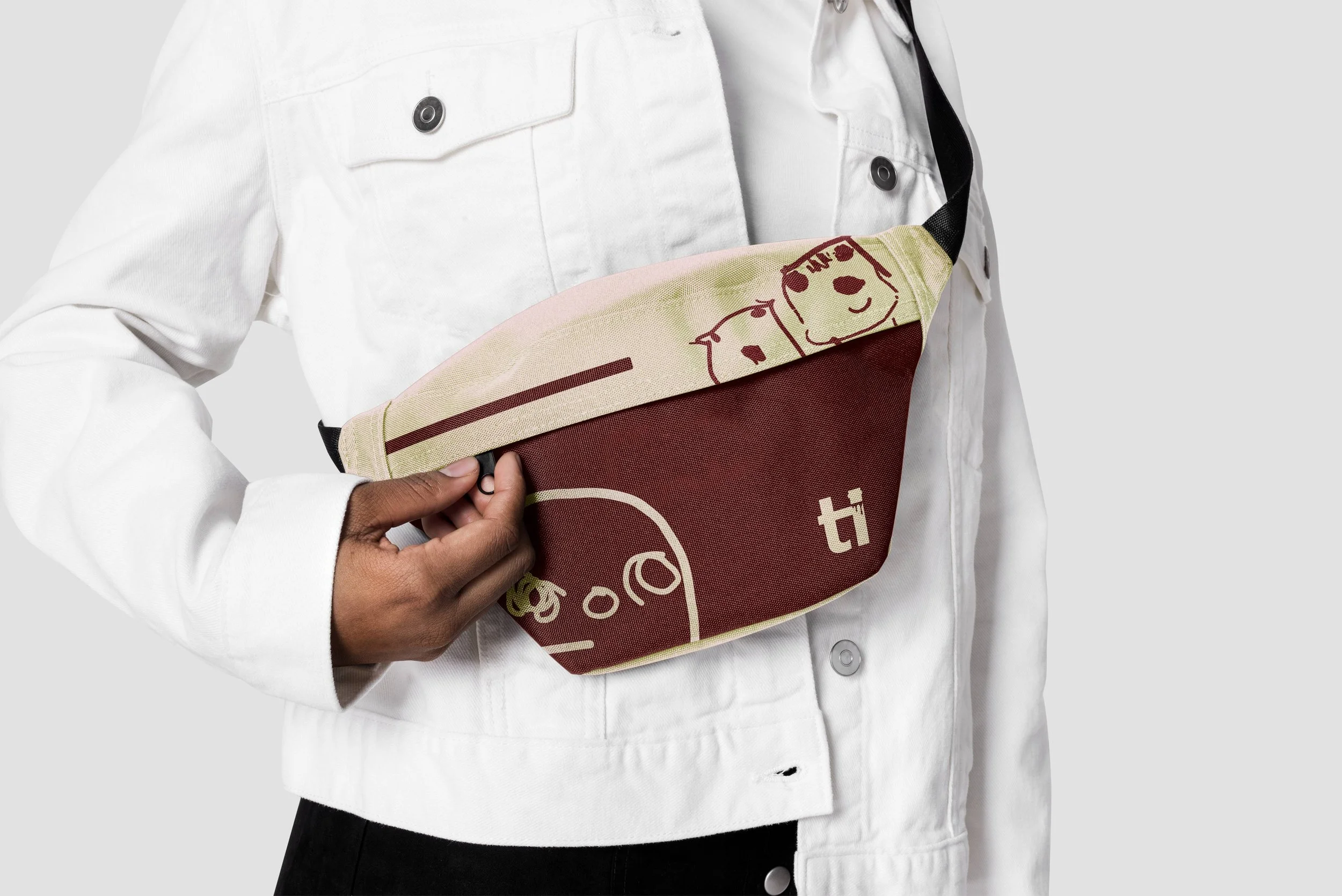
Fanny pack designed with drawings from the owner's childhood

Branded bucket hat for street style target audience

Variations of re-imagined logo

Vietnamese ca phe phin kit for customers

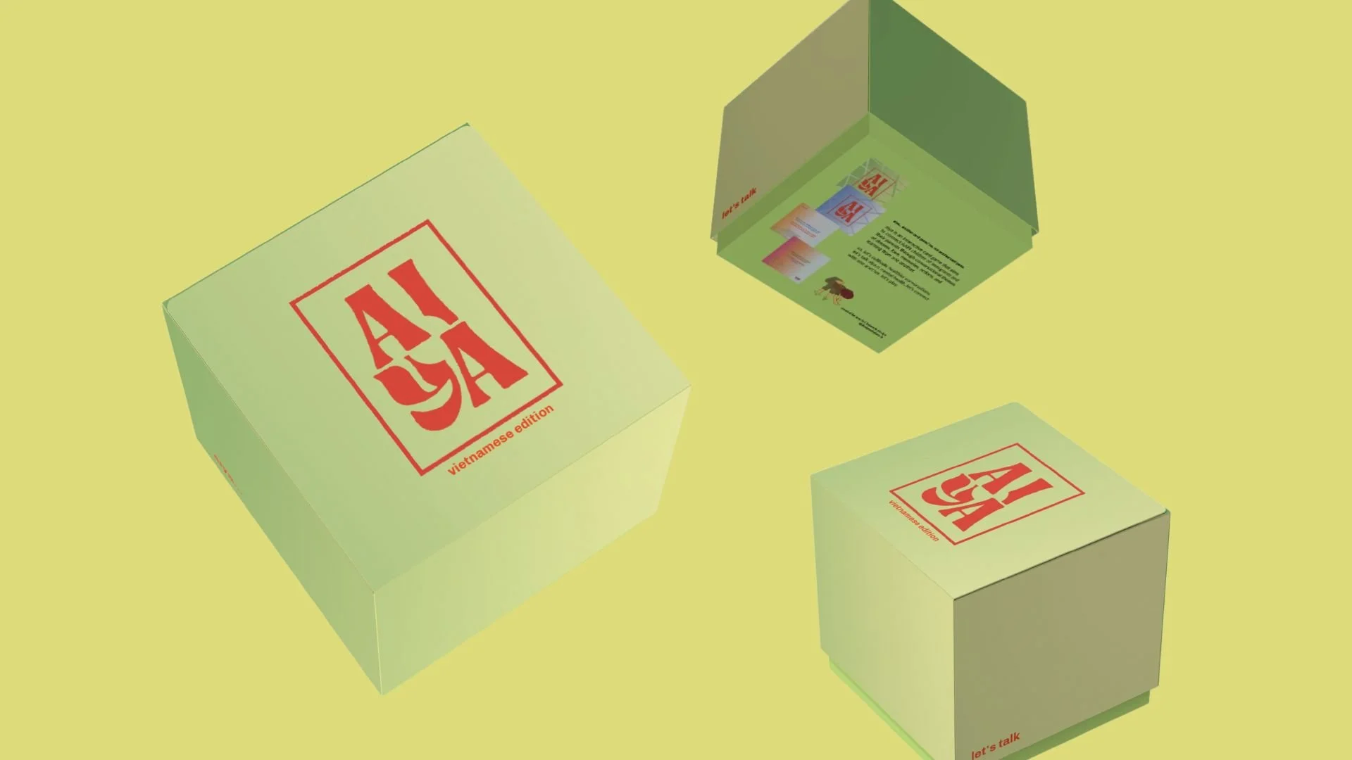
Side view of box with branding

Coffee cups with drawings from the Ti Cafe sisters childhood

Branded handout for customers to learn about the phin process

Proposed "Art Week" campaign for social media
How the Design Brewed
-
Ti Cafe was founded in June 2021 by three sisters, Shas, Shom, and Sash, who grew up brewing Vietnamese coffee with their parents. Wanting to share the bold flavors of robusta beans and fill the gap of Vietnamese representation in Colorado’s coffee scene, they opened Ti Cafe as a space that honors culture, community, and creativity. The name “Ti,” a Vietnamese nickname meaning “little one,” reflects their roots and vision.
-
Despite a loyal customer base, Ti Cafe struggled with visibility. Marketing relied heavily on word of mouth and social media, but their online presence leaned toward street-fashion aesthetics that didn’t align with the modern, clean look of the cafe itself, creating a gap in branding and limiting broader reach.
-
To strengthen touchpoints and build consistency, I proposed:
Logo: I created a logo that incorporated the “ca phe phin” filter, connecting to the traditional Vietnamese coffee they serve and are known for as the first Vietnamese coffee shop in Denver.
Social Media Competitions: Art Week installations + fashion-inspired outfit contests to connect culture, fashion, and community.
Selfie Spot: Designated photo area to boost organic content and word-of-mouth as they are popular for their art installations.
Merchandise: Streetwear-inspired accessories and a Vietnamese coffee-ware set to merge culture and style.
In-Store Experiences: Coffee-brewing demos led by the sisters, offering cultural connection while marketing their specialty.
AIYA
University of Colorado Denver Senior Thesis Project 2023
“How might I use gamification to foster healthier conversations about mental health between second-generation AANHPI young adults and their immigrant parents?
Client
Name here
Year
01/01/000

AIYA packaging/box rendering

AIYA card renderings

AIYA card renderings

Aiya green design with logo

AIYA blue design with logo

AIYA orange design with logo

AIYA magenta design with logo

AIYA logo variations

AIYA "wild card" featuring a "banh pia"

AIYA "learn" card with a cold level

AIYA "dream" card with hot level

AIYA "learn" card with hot level

AIYA "love" card with a hot level

AIYA red logo

AIYA hand-drawn visuals drafts

Rice paddy farmer drawing for AIYA
The Heart Behind AIYA
-
AIYA is an interactive card game designed to bridge conversations between AAPI (Asian American and Pacific Islander) children and their parents, centered around themes of dreams, love, memories, actions, and growth. It creates a gentle, inviting space to explore mental health with trust, vulnerability, and family at its core.
The name “AIYA” comes from a common way to express dismay, exasperation, or shock that many AANHPI (usually rooted in south-eastern and/or central Asia like Vietnam, Singapore, China, etc.) to express their feelings.
For example, “Aiya, you’re sick again?”
Therefore, I chose the name because talking about mental health or more personal questions can be taboo. It may almost be natural to say aiya… -
Mental health is often stigmatized and deeply intimate. AIYA turns difficult topics into approachable conversations that foster connection and mutual understanding.
AANHPIs ranks lowest in prescription usage, inpatient/outpatient services, and general mental health service usage. this is due to the fact that the topic of mental health holds a social stigma amongst the community that labels those with a mental illness as shameful or weak (Racial/Ethnic Differences in Mental Health Service Use Among Adults, 2015).Consequently, the mental health stigma is frequently found amongst second-generation AAPI young adults (children of immigrants) who, due to familial expectations regarding responsibilities, academics, and career, experience higher rates of emotional disorders. these mental health challenges for the demographic are often compounded by factors such as language barriers, lack of support, generational gaps between parent and child, and the struggled to assimilate to both American and traditional culture. If these challenges are not managed or addressed, second generation AAPI young adults can struggle with developing their bicultural identity, encounter great cognitive distress, and face suicidal thoughts (Mental Health by the Numbers, 2022).
Second-generation AAPI young adults encounter stressors within their lifetime that can be difficult to navigate. as their parents immigrated and/or fled their home country to the United States, they brought their cultural traditions, values, and teachings that they have known their whole life. for their child, their acculturation can pressure them to assimilate their American and traditional lives. the difficulties that the second-generation population face lack recognition and are often not addressed at home. hardships such as acculturation and stoicism become everyday challenges. stoicism is a common theme in Asian culture as parents influence their kids to only seek help when their hardships become intolerable. Parents often do this unknowingly as they endured tough and challenging times during immigration, believing that doing so will make one stronger.
-
LOGO: Inspired by traditional Chinese and Japanese signature stamps, the AIYA logo evokes that mark-you-leave-on-history feeling. I chose rich red, not danger, but luck, joy, and warmth (per cultural symbolism). To prevent rigidity, I circled the type; the round form speaks to balance, healing, and completion.
CARDS: Each card bursts with color and features Vietnamese cultural elements, think Áo Dài, rice paddy workers, bánh treats. Themes are organized by depth, "warm," "hot," or "piping," and indicated visually through richer reds and ascending steam bowls. I incorporated these levels as a visualizer of how deep questions may get, and instead of using fire, food is such a key factor in bringing families together, so I used a hot bowl (of whatever the player’s heart desires).But most importantly, each card is bilingual (Vietnamese and English), creating space for connection across generations. This will allow parents, family members, and friends to be able to read and understand on their own pace without the pressure of translating the question, which is something that many second-generation AANHPI children may have a hard time with, especially if there is a language barrier.
-
There’s no shortage of card games but few invite meaningful dialogue with warmth. Existing games lean formal and minimal, geared toward couples or traditional family dynamics. AIYA disrupts that: it’s playful, culturally rooted, and emotionally vibrant.
AIYA blends culture, clarity, and care. The bold palette speaks emotionally and the thoughtful bilingual design invites empathy and inclusivity. It's creative storytelling crafted into every card, and a design identity rooted in connection and community. There are many hand-drawn elements within the cards that relate to Vietnamese culture and can bring a sense of home, familiarity, and acknowledgement to the players.
KINDLIGHT
Branding the Mundane Project for University of Colorado Denver Design Studio II
Object
Matches
Year
2022

Brand guide for Kindlight

Touchpoint 1 introduces a reusable match case, designed with eco-friendly materials and added protection for durability. This image shows the packaging for store display.

Touchpoint 1 introduces a reusable match case, designed with eco-friendly materials and added protection for durability. This image shows the dimensions for the display.

Touchpoint 2 builds on this by offering recyclable refill packs, letting consumers choose the quantity they need without the waste of traditional paper boxes that are easily damaged during travel. This image shows the display case for stores.

Touchpoint 2 builds on this by offering recyclable refill packs, letting consumers choose the quantity they need without the waste of traditional paper boxes that are easily damaged during travel. This image shows the display case for stores.

Drafts of the process of creating the case.

Tagline for Kindlight

Kindlight logo

Kindlight icon and mascot
How it came to light
-
What if a mundane object, like matches, could feel meaningful again? I reimagined match packaging to appeal to eco-conscious consumers, transforming waste into a moment of purpose.
I chose matches as my focus, since they often compete with lighters and are typically seen as less sustainable or practical in certain situations.
-
Matches have become difficult to brand as a sustainable product. Their production relies heavily on cutting down Aspen trees—an estimated 500,000 annually to meet U.S. demand—and their single-use nature contributes to a culture of waste. While biodegradable, matches are perceived as disposable and outdated, often overshadowed by lighters. In addition, concerns about their chemical components raise health and environmental questions, deterring eco-conscious and health-minded consumers.
-
Crafted a reusable match pack with a protected ignition strip for longevity.
Easy to pack in camping bags or emergency kits without fear of the usual paper boxes getting wet, causing the matches to be “ruined.”
Offered recyclable refill boxes in tiered quantities to minimize excess.
Buy in necessity, not by price, often times, matches are sold in large quantities but end up not being used (based on consumer survey).
Recyclable packaging to have a guilt-free conscious when purchasing.
The reusable case (with matches) is not packaged, but simply sealed, therefore reducing packaging at the first purchase.
Emphasized transparency in materials, biodegradable pack, recyclable inks, to build trust.
This design gives matches a second life, sustainable, stylish, and trustworthy. It rewrites expectations by making an overlooked object something people consciously choose, again.
UCD Film & Television
University of Colorado Denver Department Identity Refresh for Design Studio III
Client
UCD FITV
Year
2023

FITV Sticker

FITV Visual

FITV Logo made by Jane Ly

FITV Slide (JL) using brand assets made by group

Designed deliverable poster created by Jane Ly

Designed brand guide on poster created by Jane Ly
A lens into My Work
-
As part of Design Studio III, I worked with a group to redesign the brand identity for the Film & Television Department at CU Denver, elevating their visual voice within university guidelines.
It started with a logo pitch between each member, narrowing down to the logo I created, and then collaborating together to incorporate the new identity into brand icons, brand voice, PowerPoint slides, and merchandise.
-
The original logo lacked personality and definition for the department. To stand out, FITV needed added color and character, while still fitting into university-wide branding rules.
-
Manipulated the font to emulate a television screen, nodding to film and modern television.
Emphasized the ampersand by placing a "test screen" inside it, blending film symbolism with design play.
Delivered cohesive branded assets: merchandise (camera straps, lanyards, premium backpacks, stickers), a poster for the atrium, and a presentation deck template.
The refreshed identity injects cinematic personality into FITV’s visual brand. It binds university structure and departmental flair, making the program instantly recognizable and thoughtfully designed.
